

RESULTS
5. THE RESULTS
Over several years of research, we have established a protocol which works across a range of different markets and conditions. We have also selected ‘buy and hold’ as our performance benchmark. Finally, we have chosen Silver as our market of choice, because it appears to be exceptionally challenging and volatile. Let’s describe how we build our actual model. We begin by creating thousands of different models of the silver markets. We use multiple different durations for the model years, from 1 year up to the maximum number of years available. With each of these models, we will also test using daily, weekly, bi-weekly and monthly data.
BUILDING HEATMAPS
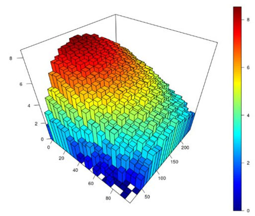
Repeating this process thousands of times for each type of indicator allows us to build complex heatmaps which highlight which parameters are strongly correlated with movements in the silver market across all of our models, and which ones are not. The heatmaps allow us to identify the general areas in which we should be concentrating, and those we should be avoiding. Our models should be right in the middle of these profitable areas, rather than choosing a localised peak. The model building begins by using parameters generated from our initial research, which was based on data across multiple different markets. Some of our Silver models may only have a small number of model years available and in this case, these models will be supplemented with data from multiple other models across other markets from our initial research phase. In practical terms, this means that as more years go by, the Silver models become less generalised and more specialised. It also means that holdout results from our models over the most recent 10-20 years should be more representative than results from 40-50 years ago. The more recent models will use more data from the Silver markets and less data from other markets.

ASSESSING PARAMETER PERFORMANCE
Our heatmaps are not designed to model pure profit, because this alone is only part of the picture. What we are seeking is profit with reduced volatility.
The Sharpe ratio has been traditionally used in measuring the performance of stock trading because it provides a straightforward way to assess the risk-adjusted return of an investment. By comparing the return of a portfolio or stock to the volatility of those returns, the Sharpe ratio allows investors to understand how much additional risk they are taking on for each unit of return.
A higher Sharpe ratio indicates that an investment is providing a better return for the level of risk assumed, making it a valuable tool for comparing the performance of different assets or portfolios on a normalised basis. This metric is useful in evaluating the effectiveness of trading strategies, where balancing risk and return is critical.
However, the Sharpe ratio has one serious flaw compared to the Sortino ratio primarily because it treats all volatility as negative, without distinguishing between downside risk (losses) and upside risk (gains).
The Sharpe ratio calculates risk using standard deviation, which measures total volatility, including both positive and negative fluctuations. However, in reality, investors are typically more concerned with downside risk—the potential for losses—rather than volatility from gains.

The Sortino ratio addresses this flaw by focusing exclusively on downside volatility, using only the standard deviation of negative returns (downside deviation) in its calculation. This makes the Sortino ratio a much more accurate reflection of an investment's risk-adjusted performance, particularly for strategies that aim to minimise losses rather than overall volatility.
By penalising only the downside, the Sortino ratio provides a clearer picture of how well an investment compensates for the risk of losses. This approach should be more aligned with investor objectives, and that’s why the project incorporates the Sortino ratio in the generation of heatmaps, and not just pure profit.
BUILDING TWO DIFFERENT TYPES OF MODEL
By incorporating the Sortino ratio in the generation of our heatmaps, our models are able to select parameters for each model element which not only maximise upside, but also aim to minimise downside risk.
We then combine these elements into the final model, utilising the custom algorithm described in the Sacred Geometry section of Analysing Price. There are, however, still two ways we can do this.
MAX RETURN
The first method is to combine the elements in order to maximise the total return over the model period. Even though the Sortino Ratio has been used to establish the optimum parameters for each element, when combining the individual elements we would seek to maximise the return that the model would have produced in the model period.
If you’re willing to embrace some downside risk, this approach will target the best return.
MIN RISK
The second method is to combine the elements in order to minimise the risk over the model period. This means seeking to maximise the Sortino ratio for the combination of elements in the model period.
In practical terms, a Minimum Risk approach is highly selective and will only be in the markets around 15% of the time compared with a Maximum Return approach. This also means there may be periods of several years where you are out of the market completely.
If preservation of capital and avoidance of downside risk is your main priority, then this approach can achieve that goal.
Before we look at the results of our model building, we have to briefly discuss the different ways we can express the returns of our models.
ABSOLUTE VS PERCENTAGE RETURNS
Comparing the results from multiple different models across multiple decades is not as straightforward as it may seem. One model might have grown your theoretic al bank from $100 to $200 in the 1980s, and another may have taken your bank from $500 to $750 in the 2000s. Even though the absolute profit is greater in the latter example, the percentage increase from $100 to $200 is far superior.
In many markets, the absolute values 50 or 100 years ago are miniscule compared with today, so using percentage returns is more appropriate than absolute returns when comparing different approaches across a wide timeframe.
SIMPLE VS COMPOUND RETURNS
If a trading approach produces 10% profit in the first year, 10% profit in the second year and 10% profit in the third year, it would be reasonable to say that the return was 30%. Let’s call that the simple return.
In actual trading, your returns would be significantly affected by prior results. Therefore, a starting bank of £100 would be £110 after one month, £121 after two months and £133.10 after three months. That’s compound returns.
Alternatively, a 10% profit in the first month followed by a 10% loss in the second month would be level with a simple calculation. With compound returns our first month would take us to £110 and our second month would take us down to £99.
COMPARING BUY AND HOLD WITH MAX RETURN AND MIN RISK
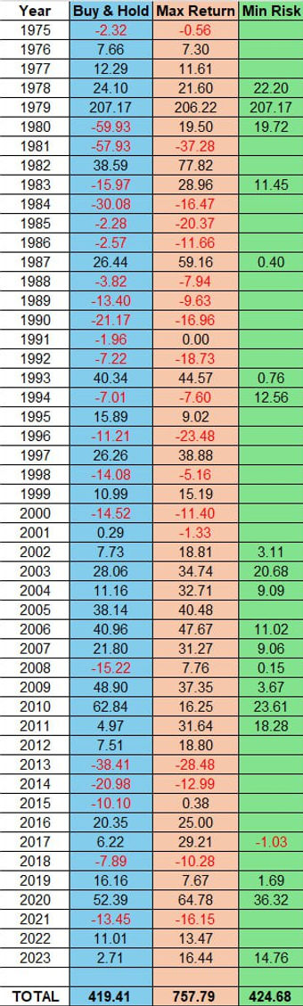
We’re finally ready to look at the results of our Silver model. These are the holdout results of our two systems: Max Return (orange) and Min Risk (green), compared with ‘buy and hold’ (blue). These are simple percentage returns, and do not include the effect of compounding our bank. For every day that a system was in the market, the percentage return is calculated and the figures above are the sum of those returns. As you can see, the Buy and Hold approach made 419% over the entire period, which was very similar to the Min Risk return of 424%. However, it’s clear that Min Risk had negligible drawdowns and was out of the market for extended periods. Max Return performed exceptionally well, producing a total return of 757%. With the effect of compounding, this return would be substantially higher, but this provides an excellent comparison against our benchmark, ‘buy and hold’. While Max Return had drawdowns along the way, they were not nearly as pronounced as ‘buy and hold’ and the profits generated over the past 20 years in particular have been substantial.

ANNUAL RETURNS OF THE THREE APPROACHES
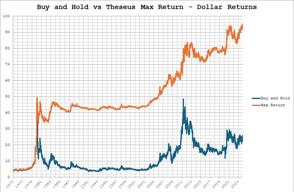
COMPARING DOLLAR RETURNS
Results run from the beginning of 1975, when an ounce of silver cost $4.44, to the end of 2023 when it had risen to $24.37. Thus, buy and hold produced a 5.5 times return on the initial investment. However, the Max Return approach produced a 20.8 times return over the same period, growing the bank from the initial $4.44 up to $92.44

What’s even more remarkable than the difference in profit is how much less volatility you would have experienced with Max Return. The average drawdown of Max Return was under 10% over almost 50 years, and the worst drawdown experienced was 32%, back in 1980. The worst drawdown of Max Return over the past 20 years was 14.8% and this improvement may partly reflect the model becoming ever more specialised to the Silver market, and less generalised, as time goes by.
COMPARING DRAWDOWNS

The drawdowns you would have experienced as a ‘buy and hold’ investor in Silver are quite extraordinary. When Silver peaked at over $46 in early 1980, it then collapsed and didn’t hit its lows for more than 10 years when it finally touched $3.50, a 92% loss from its peak. Meanwhile, the Max Return approach avoided much of the downside and was only 15% off its profit peak at the same time.

FINAL CONCLUSION
In my opinion, these results are very promising. The Silver market was deliberately selected because of its notably challenging and volatile nature, which is clearly illustrated in the chart of the ‘buy and hold’ drawdowns. In terms of dollar returns, the Max Return approach proved almost 4 times more profitable than ‘buy and hold’ with substantially less risk. It was capable of avoiding excess risk over the entire period of almost 50 years, during which time all kinds of market and economic conditions were experienced. It is worth emphasising that the best performance of the Max Return approach has been in the past 20 years, where it has been exceptionally profitable and the maximum drawdown has been less than 15%. When embarking on the formal Proof of Concept, it was hoped that this project could achieve what so many investment funds have failed to do, and beat the ‘buy and hold’ approach in the long-term. It’s fair to say that these results have exceeded those initial expectations.